Built for Impact
Brand identity, landing page, social media, and the Inputs to Impact planner. Designed for a startup connecting university clubs with high school students.
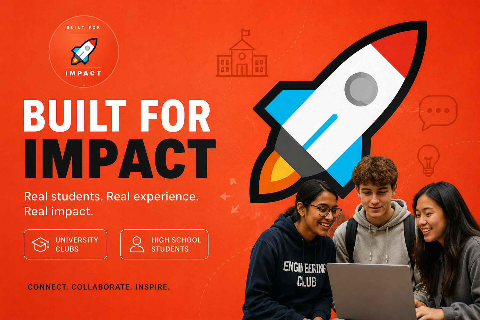
University clubs meet high school students.
Built for Impact connects university club leaders with high school students who want real exposure to fields they're considering. Not pamphlets, but actual students doing the work right now.
The design challenge: one brand that feels credible to a university club director and approachable to a 16-year-old, at the same time.
Club executives, project teams, and student mentors
Platform
Students exploring careers and building their future portfolios
From first sketch to final file.
Joining a startup mid-sprint meant stepping into a design role with no pre-built system and no handover. I worked across every visual touchpoint: brand, product, social, and presentations, figuring things out as the product took shape.
Finished the Canva-based landing page, then ran a full UX audit identifying friction points and proposing improvements to structure, hierarchy, and CTA clarity.
Defined the full visual identity: colour palette, typography rules, logo usage, and design principles aligned to the IMPACT values.
Designed the platform's signature shareable achievement card — a better, more visual alternative to the résumé that students can post on LinkedIn and share with teachers.
Conceptual design for a page that highlights participating clubs and students, showing impact without complexity.
Designed reusable post templates for announcements, spotlights, and engagement — all consistent with the BFI visual system.
Built partnership and pitch decks used in stakeholder conversations — including the Partnership Values (IMPACT) framework slides.
Orange wasn't a choice. It was a commitment.
The BFI palette needed to communicate energy, optimism, and credibility simultaneously. A saturated coral-orange carries warmth and urgency without aggression. Paired with deep navy for authority, it creates a system that works equally well on a pitch deck and a social post.
Type that works at pitch scale and screen scale.
The typography system needed to feel confident at 72pt on a slide and readable at 14px on a mobile screen. Bold, rounded geometric fonts at display size. Clean, legible sans-serif for body and UI.
Every letter stood for something real.
The IMPACT acronym was not a naming exercise — it was the operating system. I designed the Partnership Values slide so that each principle was visually distinct but part of one connected system: alternating filled and outline circles on a timeline.
Authentic and ethical interactions with all stakeholders
A supportive space for guidance, learning, and growth
Leading with enthusiasm and meaningful engagement
Following through on commitments with full responsibility
Fostering opportunities that unite teamwork and amplify success
Authentic, open, and proactive communication
A landing page should answer one question in three seconds.
I ran a structured audit of the existing BFI landing page against core UX principles: clarity of the primary message, visual hierarchy, CTA placement, and mobile performance. Then I proposed changes.
A résumé designed for people who don't look good on paper yet.
The brief was deceptively simple: design a card that highlights what students have done on the platform. But the real ask was harder — make it something they'd actually want to share.
A PDF export from a platform dashboard is not shareable. What I designed instead was a visual achievement card — part LinkedIn post, part portfolio snapshot — that communicates real engagement metrics in a format a guidance counsellor, teacher, or future employer can scan in ten seconds.
It works for both sides of the platform: high school students track their sessions and skills, club mentors document their leadership and community impact.
Shareable · Exportable · Posts directly to LinkedIn
Design work that shipped into a real startup.
"The hardest part wasn't the design. It was figuring out what the design needed to say when the startup itself was still figuring that out."